The New Robert H Jackson Center Website
Reimagined Information Architecture to improve discoverability on an information-dense nonprofit website
Team: 4 UX Consultants
Client: The Robert H Jackson Center
Timeframe: 4 months
Scope: User Research, Info Architecture, 2 Iterations
Outcome: Desktop + Mobile Hi-Fidelity Prototypes
Learnings: Improving Information Architecture for an education nonprofit
The Challenge

Through education, events and preservation, the RHJC aims to honor and commemorate Robert H Jackson, a former US Supreme Court Justice and Chief US Prosecutor for the Nuremberg Trials. The client expressed a desire to:
Highlight the breadth of work they do
Keep it engaging
Have a modernized design
Create easier navigation on the site

The Solution
With a user-focused mindset, we identified a goal to balance catering to admirers of Robert H Jackson (deep navigation) and users who are new to RHJ and his legacy (shallow navigation). Improving the way supporters donate on the site also was a priority.
Our Design Process

Understanding Users: Surveys + Interviews
Defining and Studying Our User Group
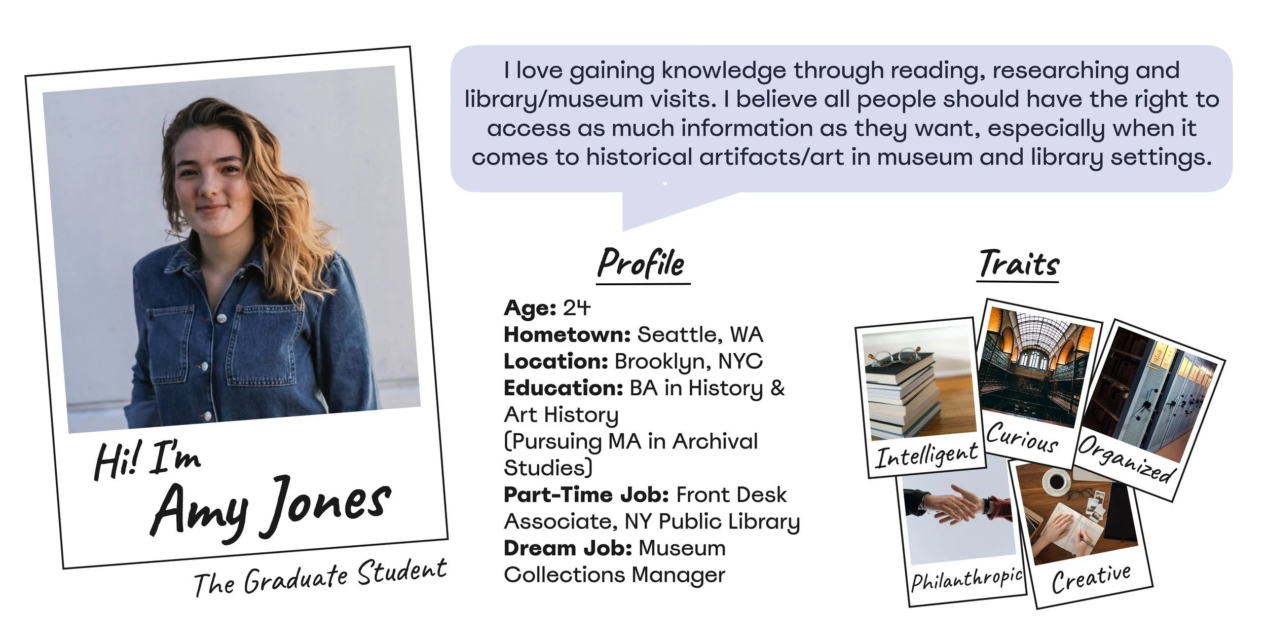
We chose to focus on higher education students - a main group of users that visit the RHJC site, and an easy participant pool to access as graduate students ourselves. A survey was dispersed to 47 participants, and 8 total user interviews were conducted.
Main research findings:
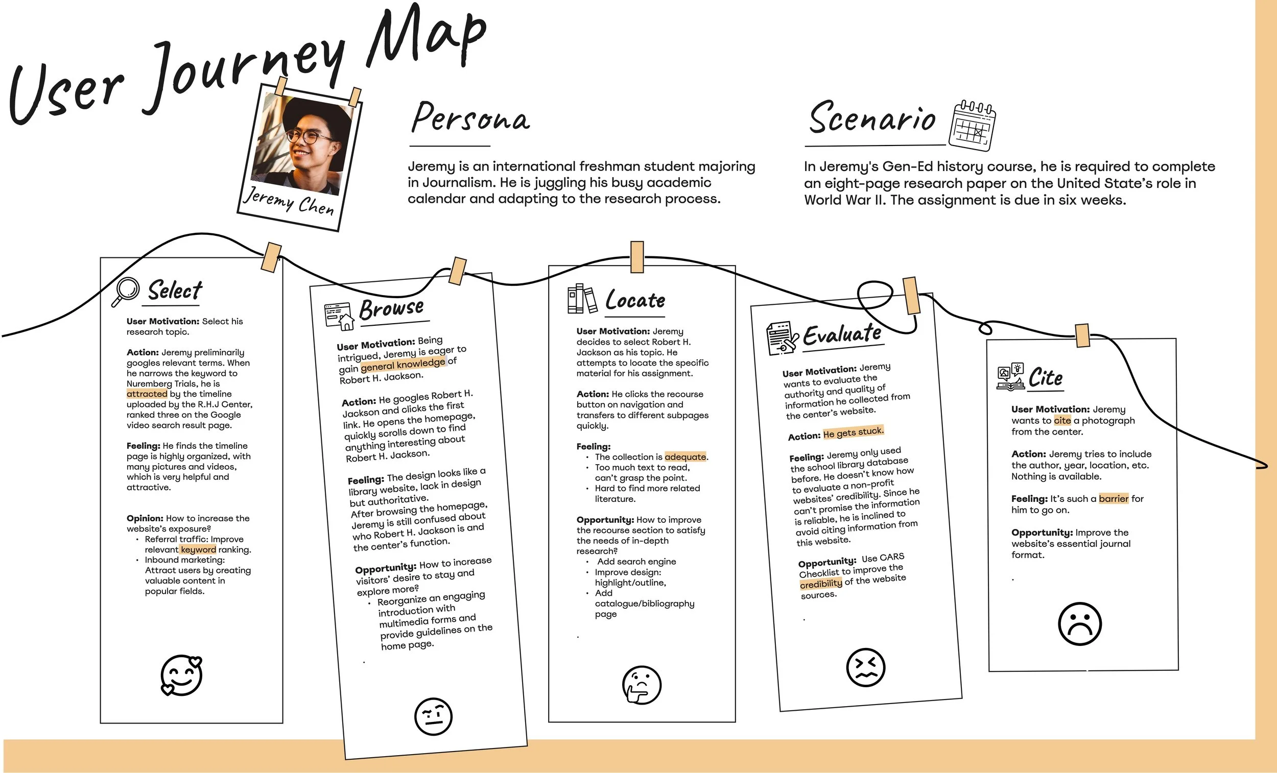
Undergraduate and Graduate students' opinions of the site differed.
Overall, most students enjoy to do research, but don't have the time.
At first glance, the students didn't understand what the site was or what it represented.
Moving Forward: What user research deliverables will help us visualize our user group and be a reference for our design decisions?
User Research Deliverables
Structure: Ideating IA Solutions
Exploring Nonprofit Category Mental Models

Our initial site map came from card sorting study insights and then we revised that map by taking into account the data collected from the tree task study.
Card Sort:
Conducting an open card sort had its positives and negatives - allowing the user to group words without our influence on their thought process, but it resulted in many categories making it difficult to synthesize the data.
Tree Test:
Word choice and organization of our nav and tasks was confusing to users. 3/5 tasks had less than 50% direct success. We changed labels in the navigation to make them more clear.
Moving Forward: We want to see our competitors strengths and weaknesses to help better understand our own.
Competition: Analysis
A look at 4 US History/Constitutional Orgs




We looked at aspects like content quality, appearance, mobile-friendliness, shallow vs deep navigation, among others. We used our review to come up with some do’s and don’ts for our final redesign of roberthjackson.org:
Use icons and imagery to keep the site fun and engaging.
Terse and interesting descriptions, with clear links to in-depth separate pages, will balance shallow and deep navigation.
Move the “About” link in the navigation bar to the far right, as the last option.
Moving Forward: Take all these findings to inform an initial interface solution.
Testing: Paper Prototype
Develop Solutions, Set up for Testing
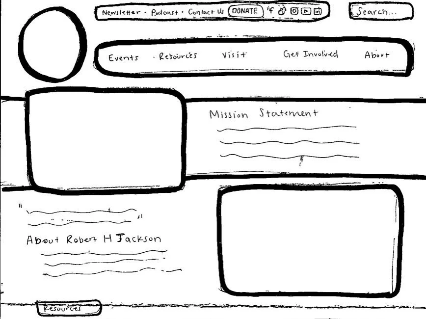
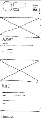
Our first sketches of our website redesign came after 6 weeks of user and competitive research. Each paper prototype page was sketched, with sticky notes used for navigation drop downs and other popups. We tested 8 users with our paper prototypes, asking them to complete two tasks regarding RHJ history and the RHJC podcast.
Moving Forward: Will users find this information architecture easy, challenging, boring, delightful?
Testing: Usability Testing
Are the flows usable?
User Feedback on Our Paper Prototypes

Improvement 1: Change “About” to “About Us” to Clarify Contents of that navigation section. Create a clear distinction between who RHJ is and what the center does.
When prompted to find information about RHJ, users clicked on "About" in the navigation bar. However, this section is devoted to the Center. For information on RHJ, the user should have clicked on "Resources" and continued to "RHJ Archive".

Improvement 2: Make main site search bar text bigger, and change the search bar prompts to “Search our Site”, "Search the Archives", and "Search by Podcast topic".
The main site search bar allows users to search the whole website, while the secondary search bars on the "RHJ Archive" and "Podcast" pages help users find specific items within those sections. Users were able to identify the main website search, but didn’t use the secondary ones.
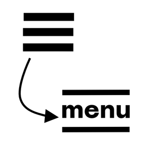
Improvement 3: Change the design of the hamburger menu icon to include the word “menu” as the patty of the hamburger.
While testing the mobile version, the users scrolled down the homepage to get information instead of clicking the hamburger menu. Users said they knew what it was, but it didn’t catch their eye.

Improvement 4: Move “Podcasts” out of “Events”>”Virtual Events” into "Resources" in the primary navigation bar.
"Podcasts" is included as a quick link on the desktop version of the site, but its also located inside the "Virtual Events" page found on the drop-down menu for "Events"in the main navigation. Many users clicked on “Resources” and couldn’t find “Podcasts”.
Moving Forward: Take these user-centered improvements and apply them in the digital wireframes.
Deliver: The Final High-Fidelity Prototype
The New and Improved RHJ Website
Clear Distinction Between the Center and RHJ, and an avenue from shallow to deep navigation

Slot Podcasts Under Resources to Match User Mental Model

Use icons and imagery the keep the site fun and engaging.

Reflection

Paper prototyping was awkward and didn’t give users an experience that was authentic enough. I’ll opt for wireframe user testing in the future.

Try deciding the categories for the card sort and make it closed - an open card sort is difficult to analyze because they’re all so different.

Designing for a specific user group and not an accurate group of actual users (RHJ fans, lawyers, teachers, etc) made our solutions less convincing for the client. It’s better to get a more accurate user group for a redesign.


