A Seamless Mobile Shopping Experience for Packit Gourmet
Conducting Remote Unmoderated User Testing to identify and solve pain points on a specialty food e-commerce site

Team: 4 UX Consultants
Client: Packit Gourmet
Timeframe: 2 months
Scope: Moderated User Test, Synthesized Test Insights, 1 Iteration
Outcome: 3 Design Recommendations
Learnings: Ideating Design Recommendations based on Moderated User Testing of a specialty food eCommerce site

Meet Packit Gourmet
Packit Gourmet is a family-owned, boutique e-commerce company based in Austin, Texas, that sells shelf-stable camp meals, cooking ingredients, and related tools and gear.

Their website aims to enhance its customers’ backpacking and camping experiences by providing a platform to easily access its products.

Packit contacted us at the Pratt Institute Center for Digital Experiences in Spring of 2022, looking for direction on how to improve the shopping experience on their mobile website.

Testing the Customer Journey
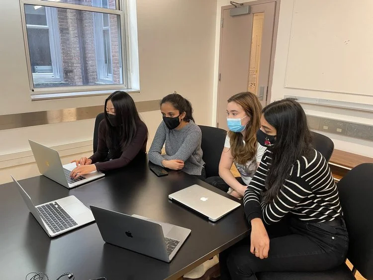
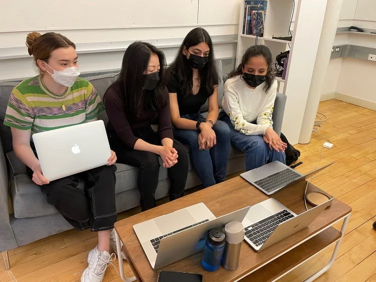
Our team of 4 UX Consultants met with the Packit Gourmet Team to set goals and expectations for the study.
the company was curious to learn about the user’s whole customer journey
curious about their website’s product pages, calls to action, and navigation through the website's information architecture
we learned about Packit Gourmet’s main customer base
Moving Forward: How can we tap into a similar customer base for testing?
Our Research Process

Recruit: Demographics
Identifying and Recruiting Packit Gourmet Shoppers
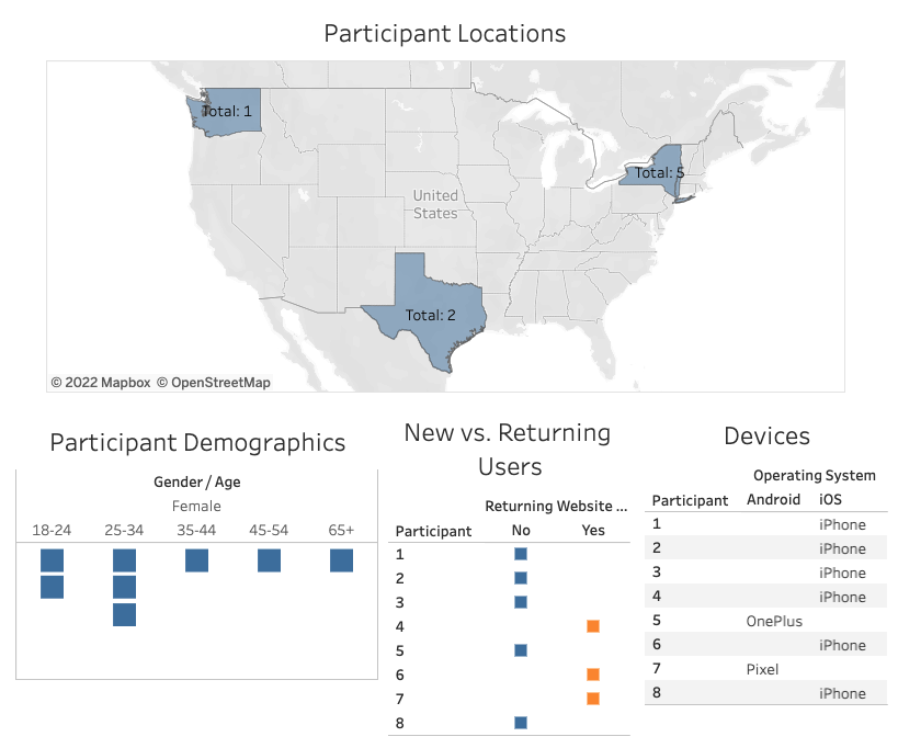
Based off of demographic data from the client and our understanding of the Packit Gourmet customer, we crafted a screening questionnaire to filter for users with:
Access to mobile and desktop devices (required)
Experience shopping on mobile devices (required)
Interest in shopping / supporting small businesses (preferred)
Interest in hiking/backpacking/camping activities (preferred)
Along with potential customers, we also had a list (provided by our client) of 3 returning customers that we screened and tested.
Moving Forward: How do we best simulate a shopper’s experience, and how can we best collect data?
Test: Our Methodology
Simulate a Shopping Experience
We designed a Moderated Usability Test. While completing the tasks, participants were asked to think aloud so the moderator and observers could understand their decisions.
Moderated User Testing is the gold standard of User Research, because it allows usability experts to moderate and observe users experiencing the product in real time. Our team carried out eight usability tests on the mobile version of packitgourmet.com.
Moving Forward: What details do we need to plan for the test?
Test: Components
Scenario, Tasks, and Questionnaires

Moving Forward: Collect Data from Tests and Synthesize.
Analyze: Synthesized Problems
Some Issues with filtering, login and product page structure

From a master list of identified issues in each test, we synthesized the data into a smaller list of 7 reoccurring difficulties the participants faced. From there, we chose 3 key issues to highlight that, if improved with simple design changes, would have the most impact on the usability of packitgourmet.com.
Moving Forward: How can we solve for the 3 key issues?
Iterate: 3 Recommendations + Mockups
Our Solutions
Here were our final three recommendations to the client:
Problem 1: The filters and sort options are difficult to use.
“It took a really long time to scroll through the filters before I found the section I needed.”
Recommendation 1: Redesign the filters as CTA buttons and accordion popup.
By making Sort and Filter options clear CTA buttons, we improve their discoverability. Creating an accordion style filter pop up eases cognitive load of the users by reducing scrolling.

One participant mentioned that although the icon was placed in the correct location, they still wouldn’t have thought of clicking on it to log in to their account.
Problem 2: The login icon is difficult to identify.
Recommendation 2: Replace the tent login icon with the universal account icon.
Replacing the tent icon with an account icon that users are familiar with will reduce the intellectual load on the users and facilitate seamless access

Problem 3: Important information is buried in the product pages.
Participants struggled to find pertinent information for their tasks (i.e. dietary needs, serving size, etc.) within individual product pages:
“I don’t see anywhere that says it’s gluten-free, so I’m not sure if I should get that.”
Recommendation 3: Restructure the hierarchy of content on the product page, and add tappable info popups describing any confusing labels.
This ensures important product information (such as dietary needs, a succinct description, and ratings/reviews) is discoverable.
Reflection
A more diverse testing group in terms of gender would have better reflected the client’s customer demographics

The Pratt listserv provided many participants that are studying UX research and design, giving them a different perspective from the everyday user

Research-Backed Findings + Actionable Fixes = A Happy Client
