A Clearer, More Engaging ULTAbeauty.com
Independent Project
Timeframe: 1 month
Scope: Secondary Research, Journey Mapping, Copy Guidelines, Style Guide, Wireframes, User Testing, 1 Iteration
Outcome: Full Product Rewrite + Style Guide
Learnings: Full UX Writing Process for beauty eCommerce
A Full Product Audit and Rewrite to improve navigation, filtering, checkout and reviews on a leading beauty eCommerce site
My Design Process

Research: Literature + Market Review, Digital Ethnography
The State of Beauty eCommerce


Market Research:
massive state of growth in the beauty eCommerce industry
Literature Review:
AR Try-On used more after pandemic
Gen Z wants more Virtual Try-On
Ulta’s making moves
Digital Ethnography:
User reviews of ULTA.com are low
No error recovery on placed orders
Unreliable shipping, with poor customer-company relations
Moving Forward: What are other beauty eCommerce companies doing? What type of language/labelling do they use?


Research: Competitive Review
What’s in the Market? What are they saying? How are they saying it?

Compared:
About Pages
Navigation
Shopping Pages
Product Pages
Return Policy Pages
Empty Cart Message
Main Takeaway:
MVP sites had a clear voice and mission across pages through copy (SOKO GLAM, bluemercury)
Moving Forward: What research insights can I use as reference in crafting ULTA’s new voice and new microcopy?
Research Summary

ULTA Growing Rapidly
Growing Stock, Growing Revenue, Growing Membership

Informed Purchases Online
Huge investment in beauty AR/VR, and reliance on user-generated content

Online Shopping Trending
Shopping for beauty products online since covid and and beyond

Shipping and Returns
Many posted website reviews detailing complaints about shipping costs and difficulty returning items

Crafting Voice + Tone
Need Brand Voice across pages - engages user, creates clarity through narrative, drives the mission
Informed Rewrite Goals

Define Voice and Tone
Declarative Statements, This not That Comparisons, Tone Spectrums, Style Guide

Improve Virtual Try-On
Explain what it is, give an intro and bring in Ulta’s voice

Restructure Filters
Labels, Organization, Formatting, Layout

Polish Product Descriptions
Skimmable, Hierarchy, Structure, Jargon

Encourage Quality Reviews
Rewrite the review form to be engaging, simple and add incentive

Reinforce Cancellation Policy
Put cancellation policy right above final “Place Order” button to set expectations for the user
User Journey: Scenario + 3 Tasks
Imagining User Goals
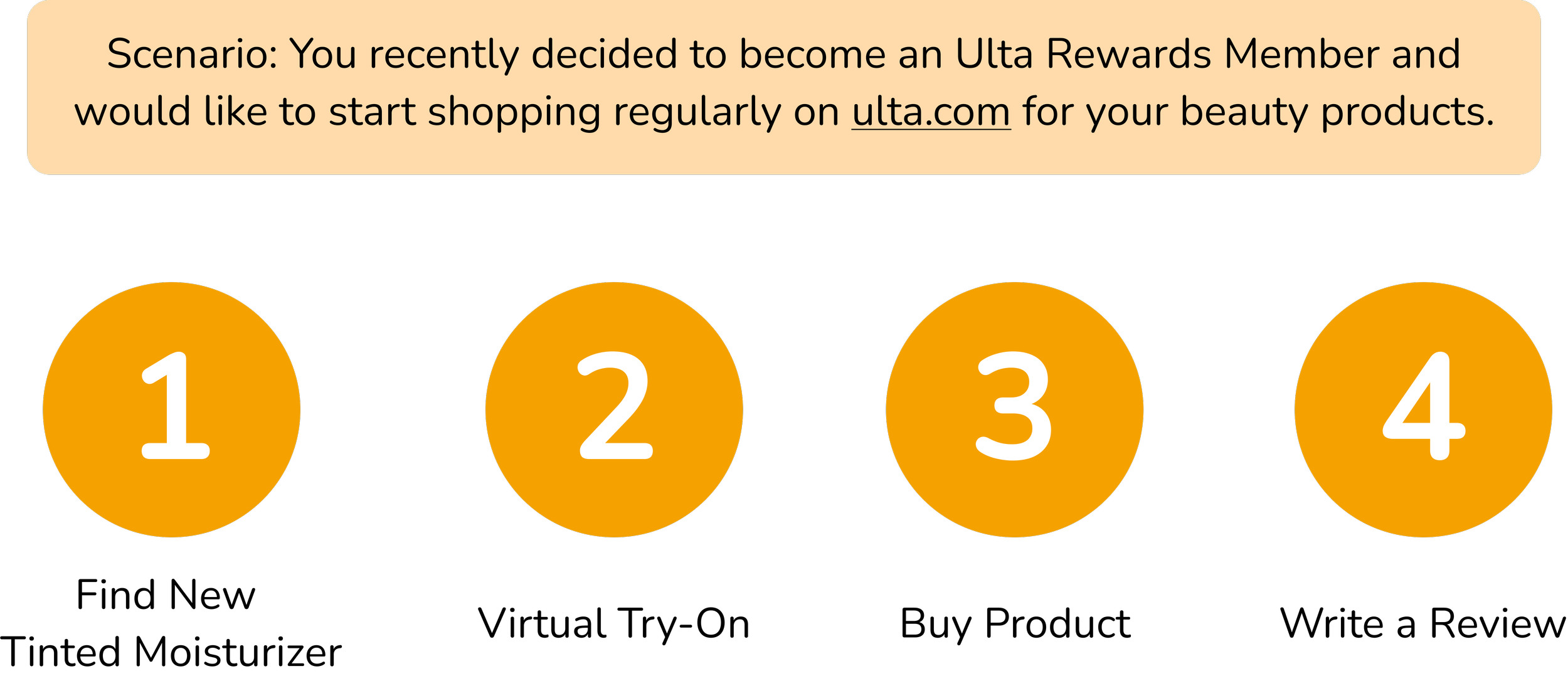
To get in the mindset of a user, I created a scenario with 3 tasks that a user might complete, all informed by my digital ethnography research.
Moving Forward: What would the possible pain points be? How can I visualize that?
User Journey: Customer Journey Map
Imagining User Pain Points

Pain Points:
Not enough filtering options
Searches for a while for reviews and Virtual Try-On glamlab
Can’t find useful information about return policy or cancellation policy
Searches a while for the review form. Review form is tedious.
The customer journey map identifies points of frustration, ease, and recommends potential fixes, all in one place.
Copy: Voice + Tone
How should ULTA Beauty sound?
3 Measurements can help us define a better voice and tone for ULTA:
Tone Spectrums:

Declarative Statements:
We celebrate the role of beauty in everyday life.
We’re on a mission to inform and inspire.
When it comes to beauty, we believe the possibilities are endless.
This not That:
Informative NOT Boring
Professional NOT Formal
Positive NOT Corny
Moving Forward: Besides following the new voice + tone guidelines, what other copy guidelines can I create for myself and others to follow?
Copy: Style Guide
Starting a New Style Guide

Moving Forward: Let’s apply these guidelines to copy language and structure in the interface!
Copy: Wireframes
Develop Solutions, Set up for Testing
My first digital wireframes of the ULTA website took my rewrite goals and copy guidelines and put them to screen.
Product Descriptions

Competitors had better filter formatting, language and organization for product details
Ulta had an unformatted block of text that was hard to read
Accordion dropdowns with titles and bullet points prevent inundation and are easily skimmable
Labels are clear, organized and reflect a user’s mental model of informed decision making when shopping
Review Form

Another takeaway from Lit Review and Market Research was the importance of user-generated content to the online beauty shopping experience
Rewrote review form to encourage users to write more reviews - these inform users shopping decisions when they can’t try on the product themselves
Added incentive of 5 points added to the Ulta Rewards Account
Moving Forward: Will users find this copy and structure easy, challenging, boring, delightful?
Testing: Moderated User Testing, Notation Exercise
Are the flows usable?
To test the usability of the new copy, I prototyped the wireframes and applied the tasks for moderated user testing, and had participants add notation to each wireframe with an emphasis on language.

Improvement 1: Change the labels below each rating level to be less subjective.
Spoke with Participant 2 about the subjectivity of ratings, especially in beauty
Confused about “Not right” - not right for who, or what? For some, “Not right for me” maybe gets only one star.
“Meh” and “It was ok” were viewed as having the same meaning
Removed in-between labels to leave room for interpretation

Improvement 2: Edit brand-provided product descriptions
Sometimes, product descriptions provided by the brand are not user-friendly. Can be taken out of context, or just poorly written
For this instance, just remove “Highly compatible and”
For the future, keep in mind the need to copy edit assets provided by brands

Improvement 3: Make sure description of Virtual Try-On clarifies, tells a story, and doesn’t cause more confusion.
Second bullet point is an attempt to be descriptive yet succinct - ended up confusing users
Wasn’t sure if lip and mascara were the only two options, since in the task she was looking for tinted moisturizer
Also not sure what happens on camera from description
“If I hadn’t read the description, I would’ve immediately seen the Foundation Category and been fine” - Participant 1
Fix: “Next, pick your favorites from one (or all!) categories - click on the product types and color varieties below, and watch your beautiful face transform.”
Reflection
Break project up by sections. A full product rewrite was difficult to complete in one month. Better prioritize the website rewrite goals:

Explore more storytelling. For instance, about page, promotional graphics, campaigns, etc.

Dig deep into return policy and cancellation policy language and placement. Frame customers expectations so that they aren’t left frustrated with a policy.