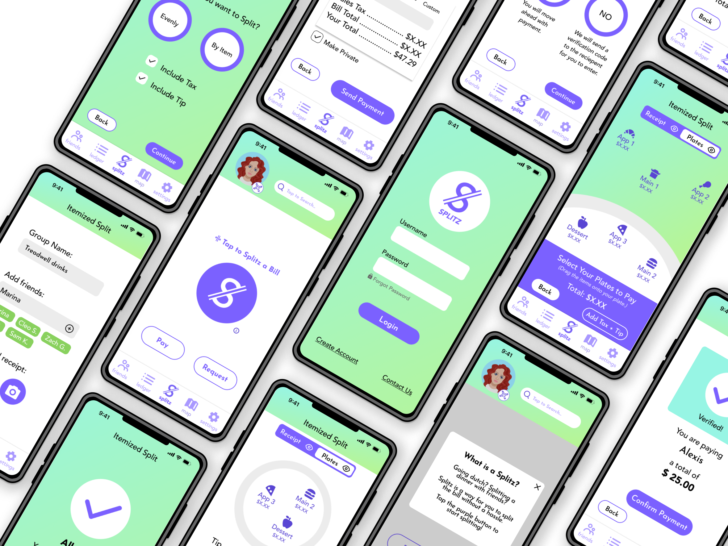
Introducing: The Splitz App
Applying Comprehensive Design Thinking to create an easy and secure bill-splitting mobile application.
Team: 2 UX Consultants
Timeframe: 4 months
Scope: User Research, Personas, Crazy 8, Wireframing, 4 Iterations
Outcome: High-Fidelity Prototype
Learnings: Design Thinking in a Mobile Application Context
Our Design Process


Discover: Survey
Splitting Payments for Users


41 users’ responses helped us define people’s daily habits and how digital payments fit into their lives:
Social Privacy: Social aspects of payment apps like required comments made some survey-takers uncomfortable
Bank Compatibility: Wait times for bank transfers from payment apps frustrated the survey pool
User-to-User Trust: Half of users like to be paid pack right away, and half don’t mind waiting
Splitting Bills: The majority of respondents like to split bills evenly over calculating exact costs (i.e. per plate)
Moving Forward: Why do users prefer splitting evenly? What are the frustrations users have with splitting bills?
Discover: Interviews
Splitting Bills: Digging Deeper

We asked why users preferred splitting evenly, how they felt about payment security/privacy, and prompted users to tell stories about sharing the bill.
Splitting + Fairness: Users agree that splitting evenly only works when everyone orders the same or uses the same services
Bank Security: Some showed discomfort with sharing personal banking information in mobile apps
User-to-User Trust: Anecdotes reveal users sometimes don’t get paid back, or wait a while, with acquaintances
Unique Identifiers: Users are worried about sending money to the wrong people
Moving Forward: Now we have an idea of users’ frustrations. How are competitors addressing bill-splitting, and what are they missing?
Discover: Competitive Analysis
What’s in the Market?


Analyzing competitors came last in the discovery phase, to ensure that we understood the users’ problems first before critiquing existing products. Some shortcomings and successes of competitors include:
Splitting + Fairness: No competitors allow users to pay their share directly to the business providing the bill. One person always ends up fronting money and asking for payment from friends.
Bank Security: Security is outlined and transparent to users at onboarding.
User-to-User Trust: Social aspect of apps (friends, groups) allow money to be sent accurately.
Unique Identifiers: QR code is a common form for a unique identifier instead of phone number or email.
Moving Forward: What deliverables can we use as references in creating our solution?
Research Deliverables
Define: Crazy 8 Ideation Session
Putting Pen to Paper


How Might We…
offer privacy to users who dislike sharing their transactions?
imagine unique identifiers that ensure security?
simplify bill-splitting so that it’s fair between friends?
increase trust when sending payments to new people?
During the Crazy 8 session, we used How Might We statements to frame our solutions:
Moving Forward: In order to test these solutions with users, we need to digitize them first.
Design: Lo-Fi Wireframes
Develop Solutions, Set up for Testing
Our first digital wireframes took our Crazy 8 results and put them to screen.
Pay Your Share of The Bill


Make Your Transactions Private


Send Money to The Right Person


Moving Forward: Will users find this information architecture easy, challenging, boring, delightful?
Design: Mid-Fi Wireframes
Implementing Initial User Feedback
Between our lo- and mid-fi wireframes, we asked users to look at our screens and give us feedback.
Our Solution: Interactive Map Tab
User Feedback:
Ledger is busy

Privacy isn’t clear
Add toggle to profile
Our Solution:
User Feedback:


Our Solution: Explain outcome of each action
User Feedback:
Verification is confusing
Moving Forward: Prototype and test flows formally to ensure usability.
Design: User Testing
Are the flows usable?
Continuing the iteration process, we connected the screens and tested our key flows. Formal usability testing revealed pain points in our prototype:

Improvement 1: Make sure users recognize the Splitz action is a button they can tap
“Oh that’s a BUTTON? Ok, I didn’t realize ‘Split the Bill’ was a button.”
-User 2

Improvement 2: Add privacy options within individual transactions when the user is in social mode
“I guess I prefer private mode, since I don’t really care if people see what I do and there are some transactions that I want to keep private.”
-User 3

Improvement 3: Make “Split the Bill” have direct payment to owed company (not payment between users) - build this out
“The star feature is scanning the receipt and sending money directly to the restaurant. I like the idea of skipping all the extra payments, requests and owing.”
-User 1
Moving Forward: We need inspiration and a guide for elevating this prototype to hi-fidelity.

Visual Design Moodboard + Style Guide

Deliver: Final High-Fidelity Prototype
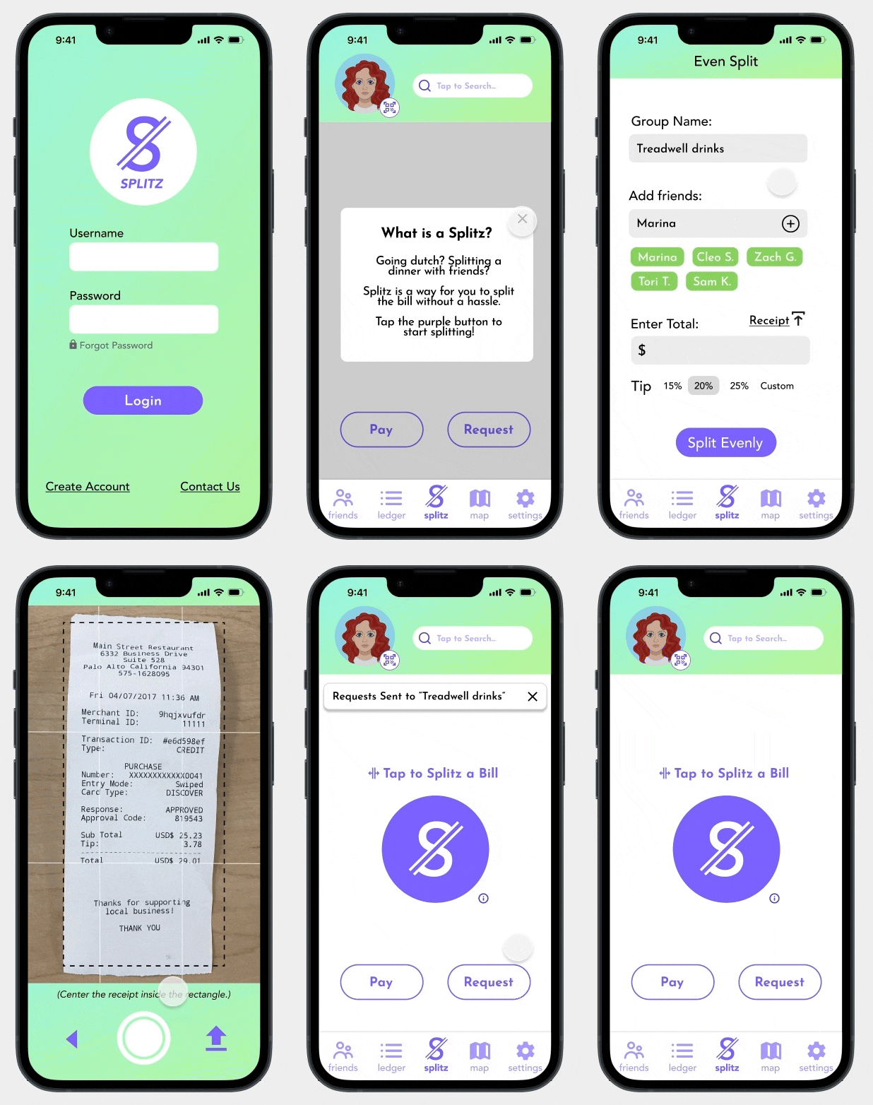
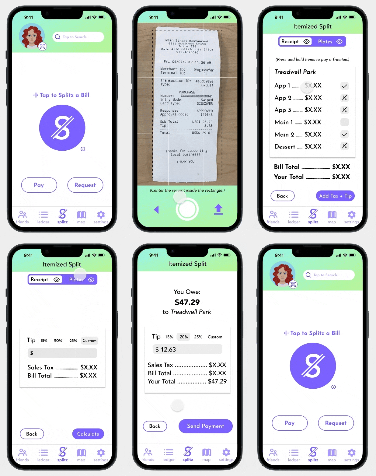
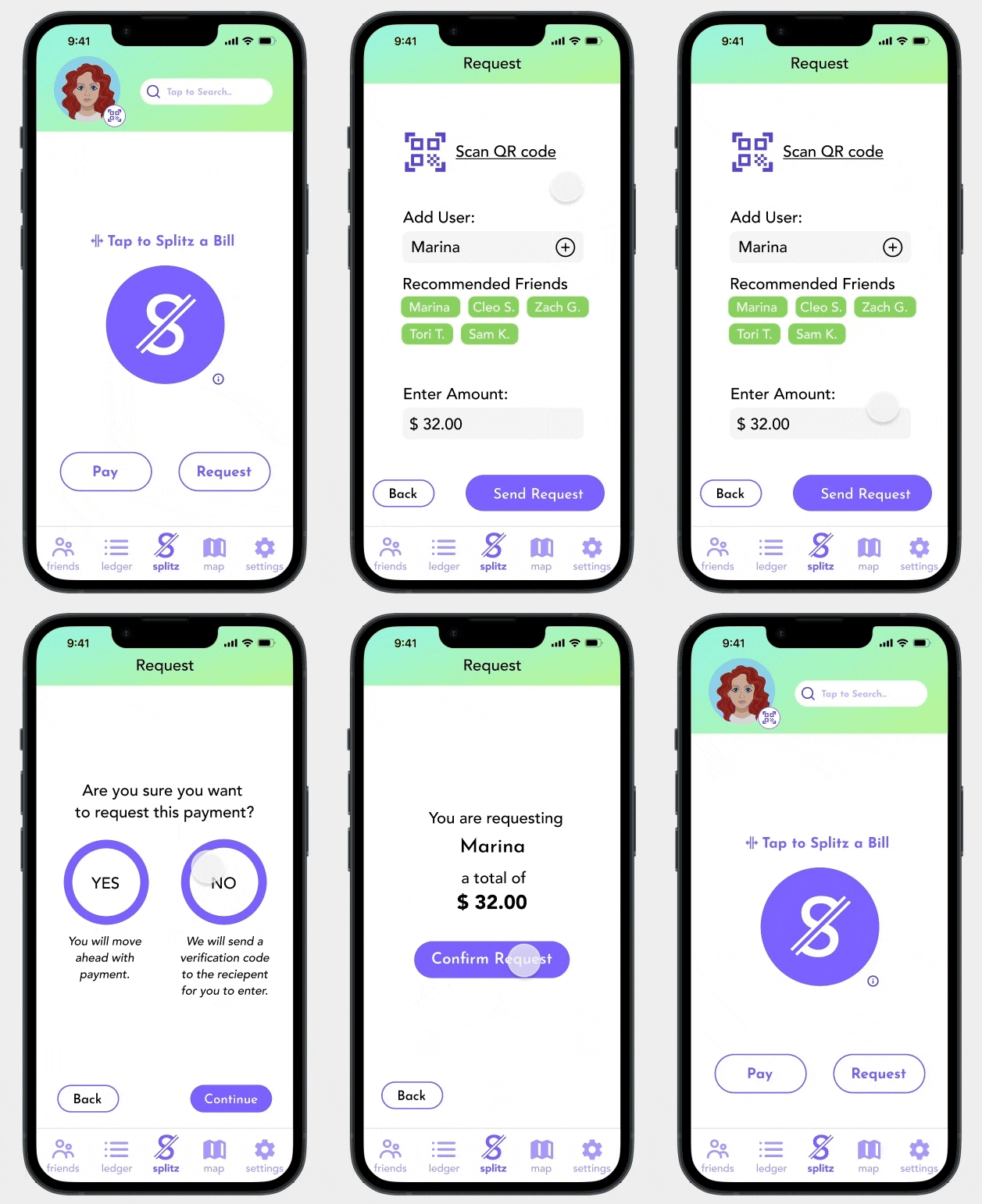
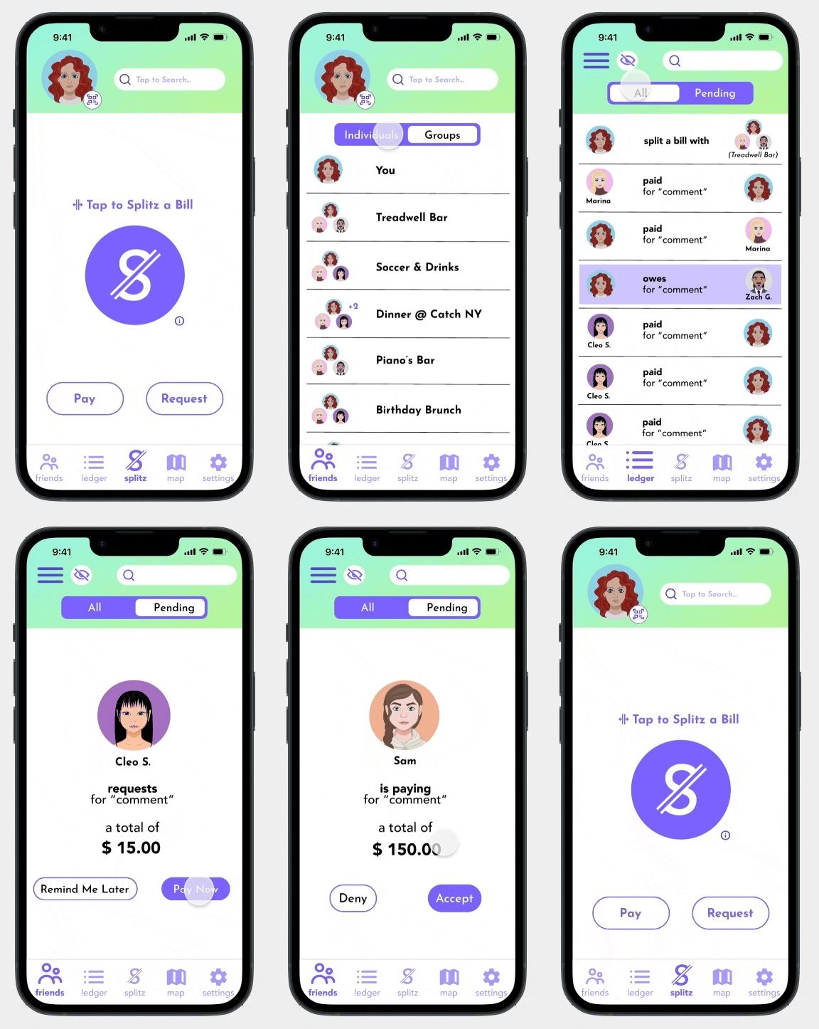
Welcome to SPLITZ, an app that allows you to split bills with assurance and ease!
Reflection
User discoverability for the main SPLITZ function was a main challenge. We learned to incorporate supplemental text to explain a new feature without cluttering the page.

Clearly separating social and private mode and making it a clear option on the app was a puzzle that we navigated throughout the design process.

Lack of time prohibited us from designing for both iOS and Android standards, and exploring all edge cases


